How I made hundreds of icons for Godot users
A look into the process of creating @icons, a free library of icons for Godot users.
Originally written on Jun 23rd, 2026.
Last month, I embarked on a new project called @icons, a library of vector-format icons for use in Godot projects. This project started when I first read this skeet by developer and former Godot project manager Yuri Sizov:
Someone should make an asset pack with custom node icons for Godot, fitting the style and using official colors for 2D, 3D, Controls, etc. 🤔 I like customizing things, but making custom icons every time is yet another sinkhole where time spent is not really paying off IMO.
— Yuri (@yurisizov.bsky.social) May 13, 2026 at 1:43 PM
What he’s referring to here is a rather neat lil’ feature of Godot, the ability for developers to assign a custom icon to nodes and classes, the building blocks that make up scenes inside the engine. Basically, you write this in your script…
// In GDScript
@icon ("res://icon.svg")
class_name MyNode
extends Node

// In C#
using Godot;

[GlobalClass, Icon("res://icon.svg")]
public partial class MyNode : Node
{
    ...
}
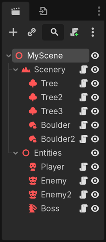
…and your node will now display the new icon inside the scene tree view, like this:
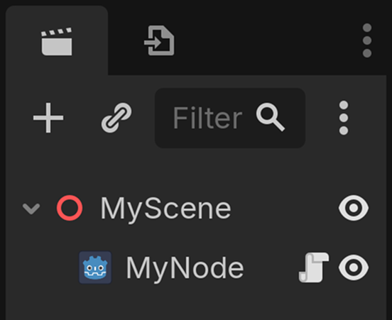
icon.svg, the default icon for Godot projects.
If your script also defines a custom class, the icon will also show in the “Create New Node” menu. Taking the time to do this is a great way to make complex scenes more readable at a glance, especially if you have a lot of nodes of the same type, like Node3D, StaticBody3D, etc. For developers of plugins that add custom nodes, it’s also a great way to add extra polish and really make it feel like it belongs right alongside the built-in ones!
But Yuri makes a good point, in that designing icons takes time and effort that would likely be better spent elsewhere… unless you happen to have my variety of brain chemistry, in which case you love making icons. Indeed, I’ve been designing icons for years, for various projects, and it’s consistently one of my favorite parts of UI design.
What I never really attempted however, was a public icon pack. One like Lucide or Font Awesome, but specifically designed to be used as icons inside the Godot editor. Credit where credit is due, I am not the first one to create such a thing, but most existing packs didn’t exactly meet the criteria of fitting with Godot’s existing icon style, usually depicting icons in a pixel art style. Nevertheless, it seemed like a fun project and a way to flex my icon drawing muscles, so I decided to answer the call. But first, I needed to figure out a couple of things.
What exactly is Godot’s style of icons?
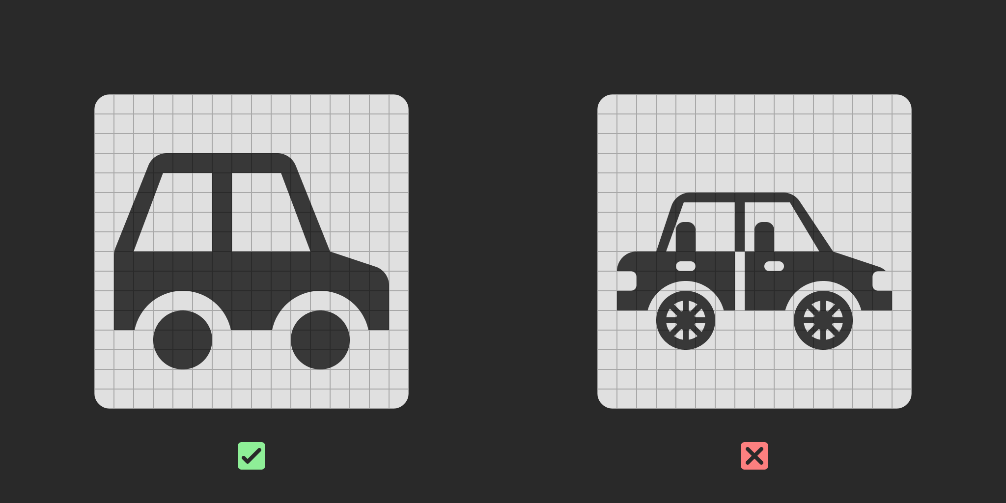
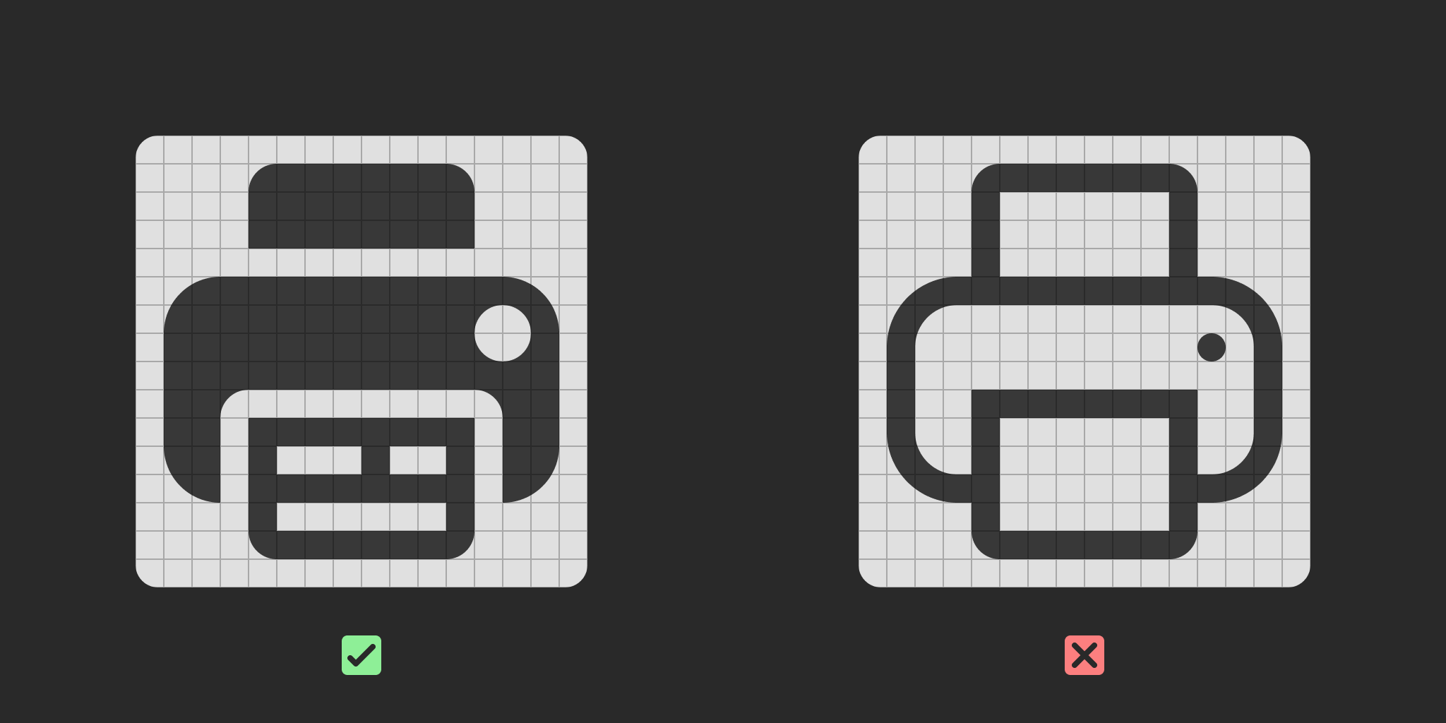
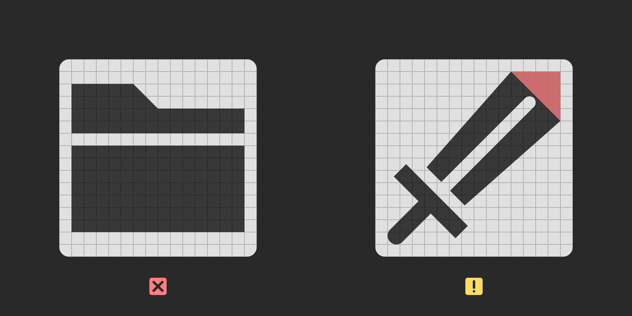
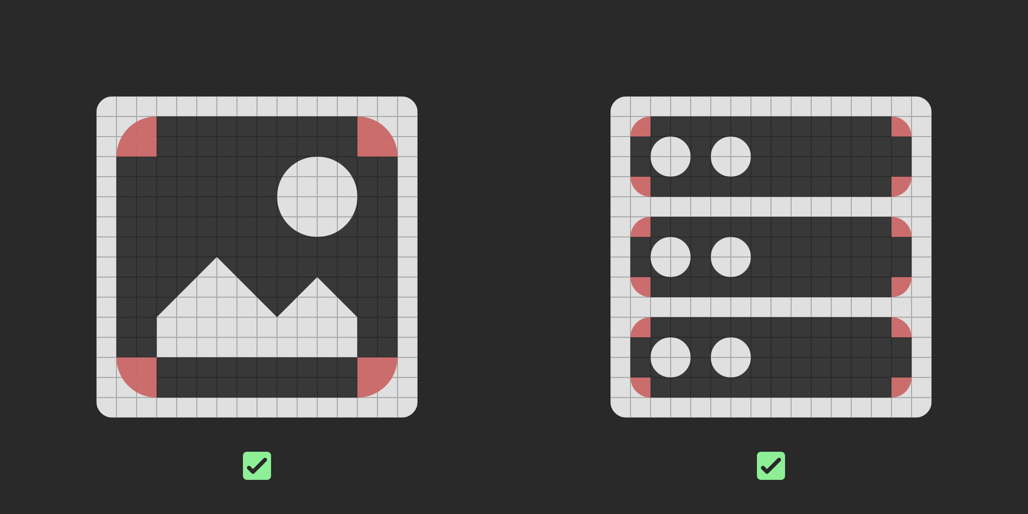
If I want to make my icons fit alongside the ones in the Godot editor, I first need to find a set of design guidelines, which define how an icon should be constructed, what is and isn’t allowed, in order to ensure cohesion within the set. Stuff like whether the icons are filled or not, how complex or dense they’re allowed to be, what scale they should be designed at, etc.
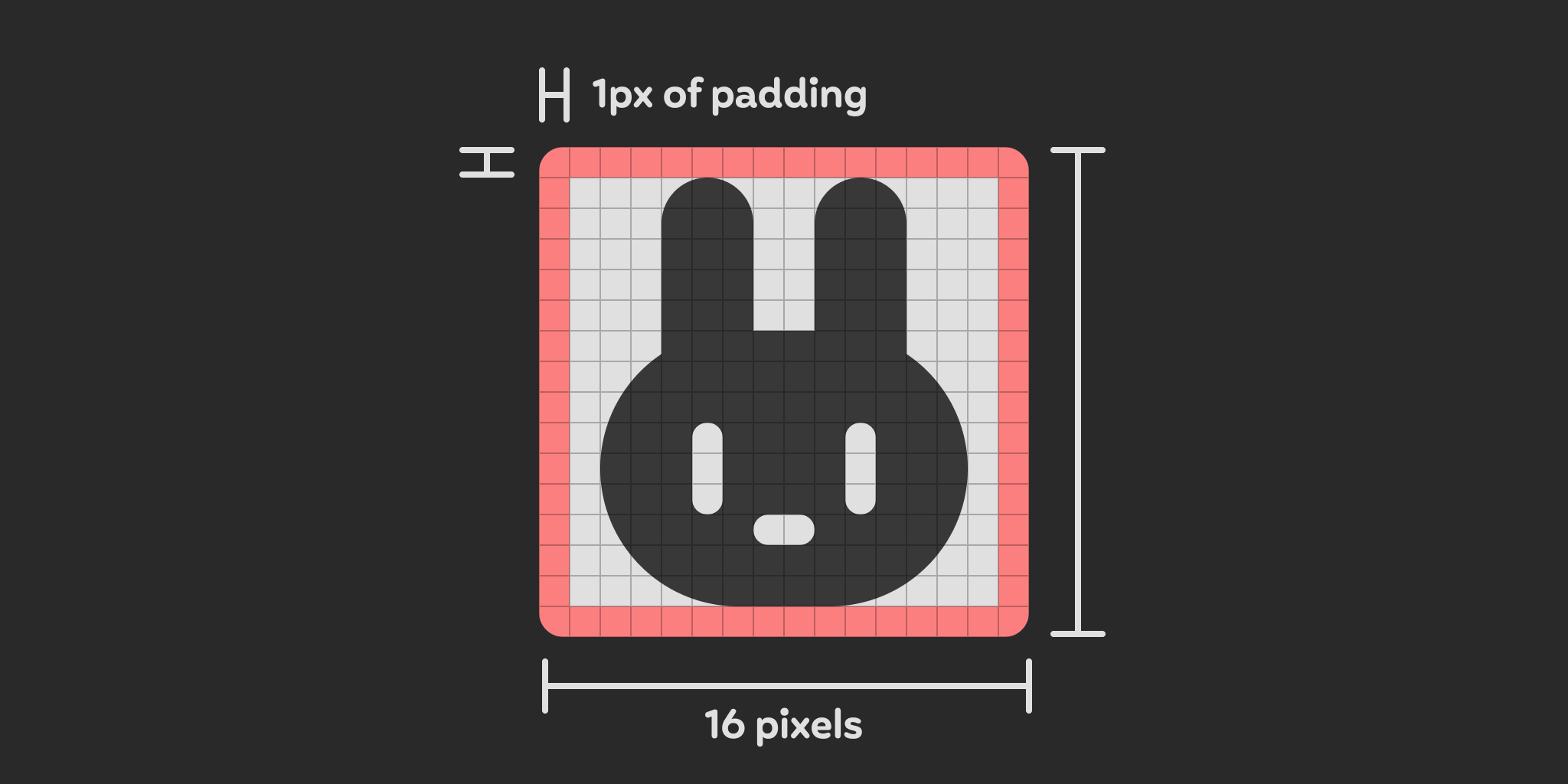
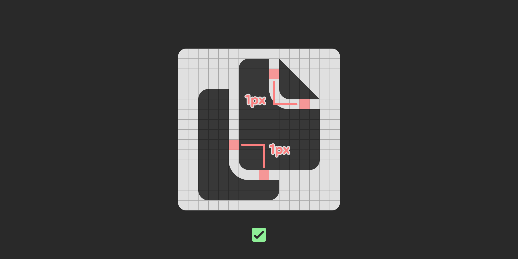
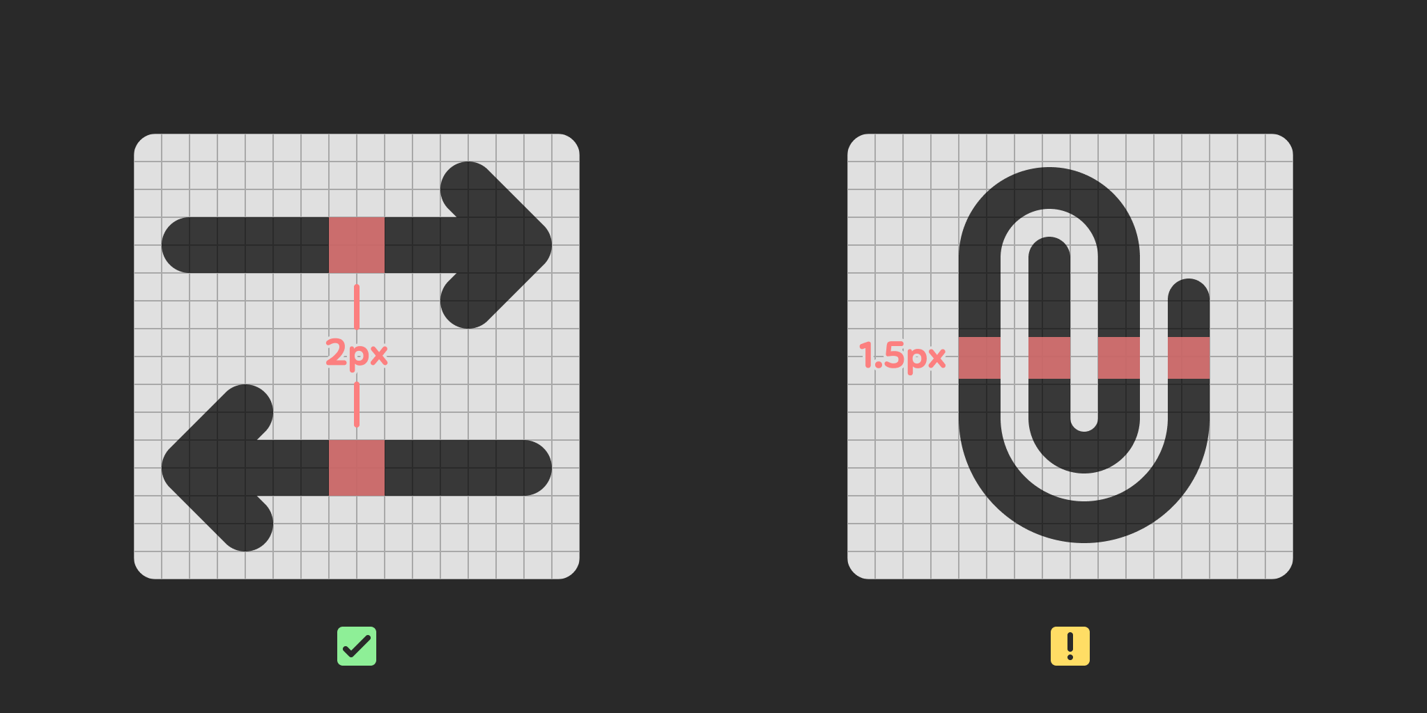
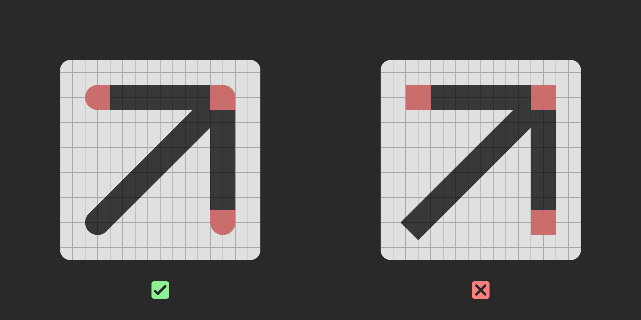
Unfortunately, looking at the documentation regarding submitting new icons to the project, there isn’t much to be found. It does define a canvas size of 16 × 16 pixels, requires lines and shapes to be snapped to whole pixels to ensure crispness, and to restrict color usage to predefined colors to ensure Godot can automatically adapt them to the user’s theme, but that is all.
This lack of guidance may explain why the engine’s icon set can be rather inconsistent at times, since individual developers are responsible for creating the icons whenever they add a new feature that requires them, and likely aren’t overseen by a designer in the process. I can’t really fault them for it, though. After all, the people tirelessly contributing to the engine’s development are programmers first and foremost, not designers. This kind of scrutiny over what can be easily dismissed as unimportant details is likely something they have little concern for, as long as the icon does a good job to convey the information associated with it.
I’d wager that proper design guidelines would still be worth it, especially with recent efforts towards making the editor’s interface sleeker and improving its UX, but that’s a topic for another day. Until then, my only option is to download the icons, thankfully very easy due to the project’s open source nature, and stare at them very closely in order to reverse engineer their design language.
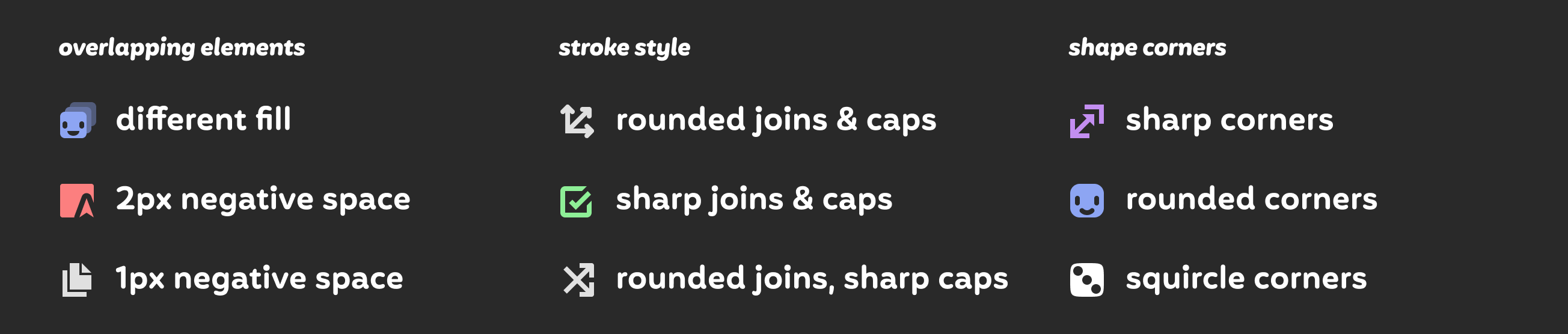
As I’ve said moments ago, the icons do suffer from inconsistencies, meaning I had to make a few decisions based on what I think would look best at the scale we’re working with. Here’s what I came up with:
That should be a pretty solid set of guidelines, which means I was ready to move on to the next step…
Planning a list of icons
Part of what makes this icon library interesting to design is its intended audience. Typical icon sets, like the ones I listed above, will contain icons meant for general purpose user interfaces, the kind of symbols you’d find in your typical phone or desktop application. Basic file management, navigation, text editing, devices, media playback… Of course, my pack would also need those, being ubiquitous to basically all apps, but game developers have more specific needs, and I knew I had to cater to those.
I started listing broad categories and filling them with anything I could think of that I imagined would be useful. Things like buildings, terrain elements, typical game items, weapons… as well as more technical concepts like joints, tilemaps, UI widgets, mesh editing, the likes.
When I started the design process, I had a list of over 200 items, but the number would increase as I came up with new ideas and received suggestions from people as I shared my progress. For the first release, I decided to cap it at 400, and as I’m writing this, it’s sitting at 511. Not bad!
Time to get drawing
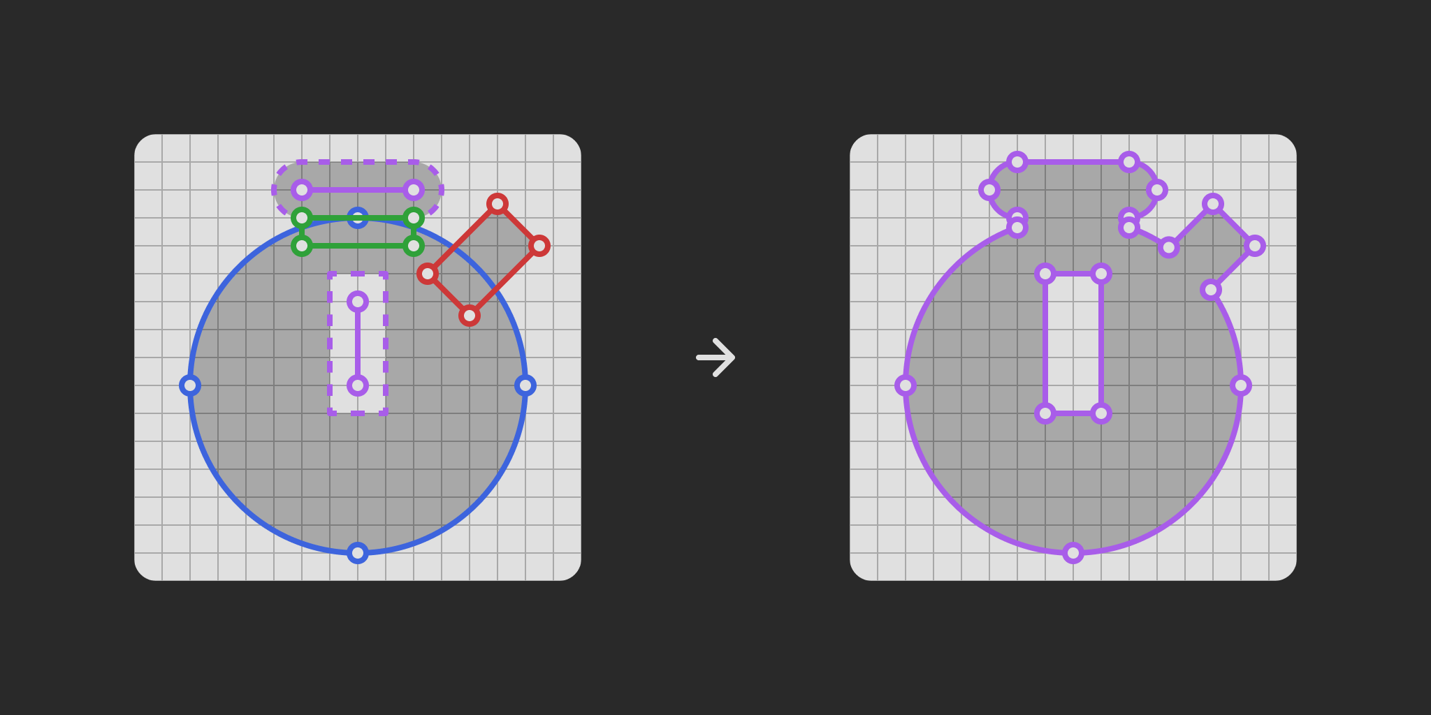
Here’s what the process of actually drawing the icons looks like. Just like nearly all of my design work these days, I use Figma, a really popular browser based UI design and prototyping tool. I’ve been using it for several years at this point, and came to really enjoy its vector editing tools, which include a lot of really convenient features like non-destructive corner rounding and boolean operations (which let you merge shapes into one, or cut one shape out of another, for instance, something known as the “pathfinder” to Adobe Illustrator users!)
In spite of its ongoing enshittification and push towards bullshit AI features, typical of a tech company going public, I begrudgingly stick with it, as it remains one of the most lightweight and comfortable vector drawing app I’ve used to this day.
After preparing a little template frame of the correct size and padding, I just run through my list and start drawing. Once I get in the zone, I can usually get a few dozen icons done per day. Granted, it helps that some icons are more derivative than others, like arrows. 😛
Typically, a finished icon will contain a lot of shapes and strokes that are combined in various ways with boolean operations, but as it is, it’s unsuitable for use within Godot, so they need to go through a flattening process, to ensure every element is rendered as a single filled path in the final SVG file. Of course, I keep the original around so I can tweak it if necessary, or reuse elements from it in other icons. Then, I convert it to a Figma component, which allows me to define metadata for each icon.
Metadata is something I’ve began adding for release 1.2.0, and I use it to provide aliases for each icon. Basically, it’s a list of keywords that I thought people would be susceptible to use when searching for a specific icon. Take the icon for dice, for example. It can represent the physical objects themselves, of course, but one could also use it as a metaphor for board games in general. They’re also a very common way to represent the concept of randomness. So, my alias metadata for the dice icon ends up looking like this:
"dice": {
    "description": "die, play, game, board, random, randomize"
}
I hope it’ll make the process of looking for specific icons more convenient, especially as the number of icons grows in the future!
The tedious part
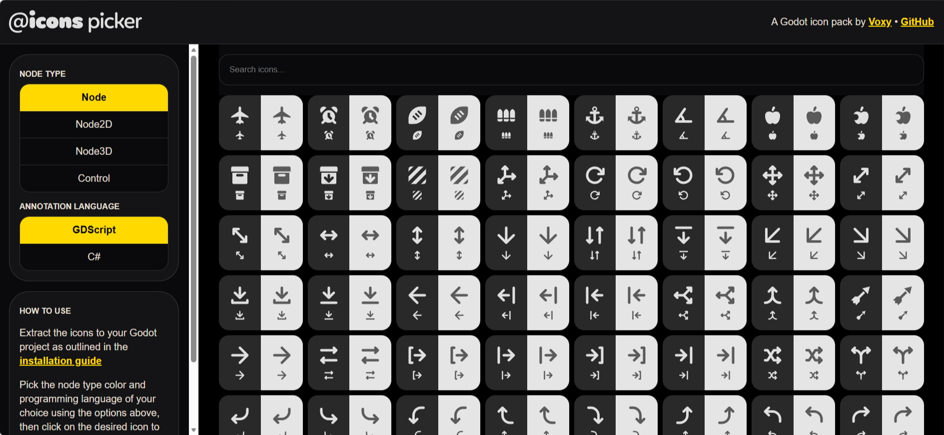
Now that I have designed all my icons and flattened them, now’s the time for the unfun part: exporting and packaging. While I can at least bulk export in a single click, I need to do it 4 times in total, each in a different color. This is necessary because color is used in the Godot editor to differentiate between different node types. Nodes that represent 2D objects like sprites and tilemaps are blue, 3D objects like meshes are red, GUI elements like buttons and popups are green, and everything else is gray. There are actually many more colors for much more specific types of resources, but I chose to stick with the main 4 node types for now. Perhaps if there’s enough demand, I’ll consider adding more colors, but for the time being, I think it’s fine.
Once I have all my icons exported, I run them through a utility called svgo, which optimizes them and reduces their filesize, an important step to not make the importing process in Godot overly slow. Speaking of importing, I also set up a Godot project inside my main work repository (though it is ignored by Git and thus not present in the public repository). This lets me generate the import files used by Godot to determine how it should treat those images. This is very important because for the icons to work as intended, they need specific import options to be enabled, to allow them to adapt to the user’s theme and scaling settings. This way, I can provide them directly inside the addon, so they’ll just work out of the box with no additional setup required from the end user.
Finally, it’s time to update the web picker, a utility I created that fulfills three functions: letting the user easily preview all the icons, allowing them to search for the ones they need, and giving them a way to copy the code required to assign the icon to a node, so they don’t need to type it in manually each time.
Like all of my web projects, I’m using ol’ reliable Jekyll, a real workhorse of a static site generator that may not be the fastest nor the most modern, but dang it, it works real good for what I do. Static site generators in general are great for this kinda stuff, because they always provide ways to automate a lot of tedious work. For instance, writing the markup to display hundreds of icons would be absolute torture, but thanks to Jekyll, I can just use a for-loop:
{% assign sorted_icons = site.data.icons | sort %}
{% for icon in sorted_icons %}
<article class="icon-card"data-icon="{{icon[0]}}" data-aliases="{{ icon[1].description }">
    <div class="display-dark">
        <svg class="icon large">
            <use href="#{{icon[0]}}"></use>
        </svg>
        <svg class="icon">
            <use href="#{{icon[0]}}"></use>
        </svg>
    </div>
    <div class="display-light">
        <svg class="icon large">
            <use href="#{{icon[0]}}"></use>
        </svg>
        <svg class="icon">
            <use href="#{{icon[0]}}"></use>
        </svg>
    </div>
    <p class="tooltip">{{icon[0]}}</p>
</article>
{% endfor %}
All I need is to feed it a data file containing the name of every icon and its associated aliases, which I can generate automatically thanks to this handy Figma plugin, and Jekyll will run through every element in that list, and create the appropriate markup. Nice!
I also wanted to make sure the picker could exist as a single standalone HTML file, that could work offline and regardless of where the user decides to keep it. As such, I also need to bundle all the icons into said file, which involves another processing step of combining them into an SVG spritesheet using this utility, and making sure their color can be adjusted dynamically.
As for the actual functionality of searching icons and copying the relevant declaration to the clipboard, well, that’s nothing which can’t be fixed with a bit of JavaScript, gathered from people much smarter than I am who generously shared their knowledge on StackOverflow.
Phew… that was a lot of annoying stuff to deal with, but now, we’ve got a complete release that I can share with the world, and which you can download right now from itch.io, GitHub releases, but also from the Godot Asset Store and Asset Library!
Closing thoughts
I’m really glad I decided to launch @icons, as it turned out to be a really fun project to work on (if a little annoying once the actual designing process is over). What surprised me the most was finding out that a lot more developers desired this than I had imagined. It was wild waking up to hundreds of notifications on my WIP posts on Bluesky, and seeing all the support from a bunch of awesome developers and creators I admire, including the assets GOAT himself, Kenney(!!), and some Godot team members. 🤯
Suddenly having this many eyes on my project sure is stressful, especially when you’re not all that used to it. It puts a lot of pressure on making sure I can meet the expectations of as much people as possible, but ultimately, I’m so happy to see the overwhelmingly positive reception towards my dinky lil’ icons. As I’m writing this, @icons has been downloaded a little over 1.3k times across all platforms, and some very kind people have also donated on itch.io, for which I’m supremely thankful for! ❤️
This library is open source under the MIT license, and while I don’t accept direct contributions at this point, I do accept suggestions alongside bug reports in the repository’s issues page.
Thank you so much for reading this and supporting @icons. I plan on updating it with new icons for as long as I can, and I hope you will continue finding it useful for your own games and plugins. Have a lovely day!