Welcome to my new space!
I spent the last few weeks working on a brand new version of my website, here's a rundown of all the new stuff.
Originally written on Jun 19th, 2026.
I’ve been neglecting my website lately, having forgotten just how nice it was having one in the first place. But at last, after a couple of false starts and a few weeks of work, the new version of voxy.space is live! And what better way to celebrate than to walk you through all that shiny new stuff I’ve made for it?
Bold new visuals
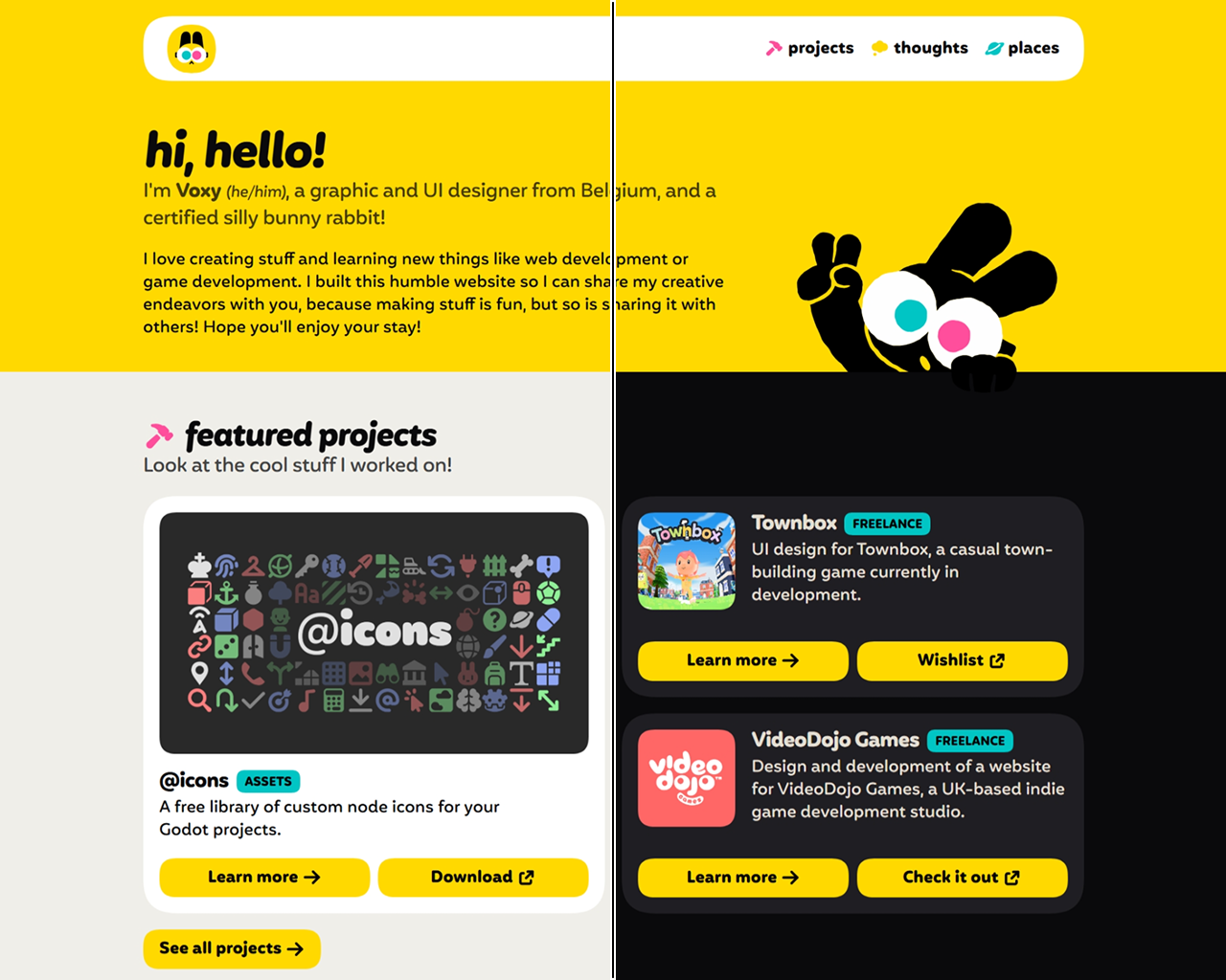
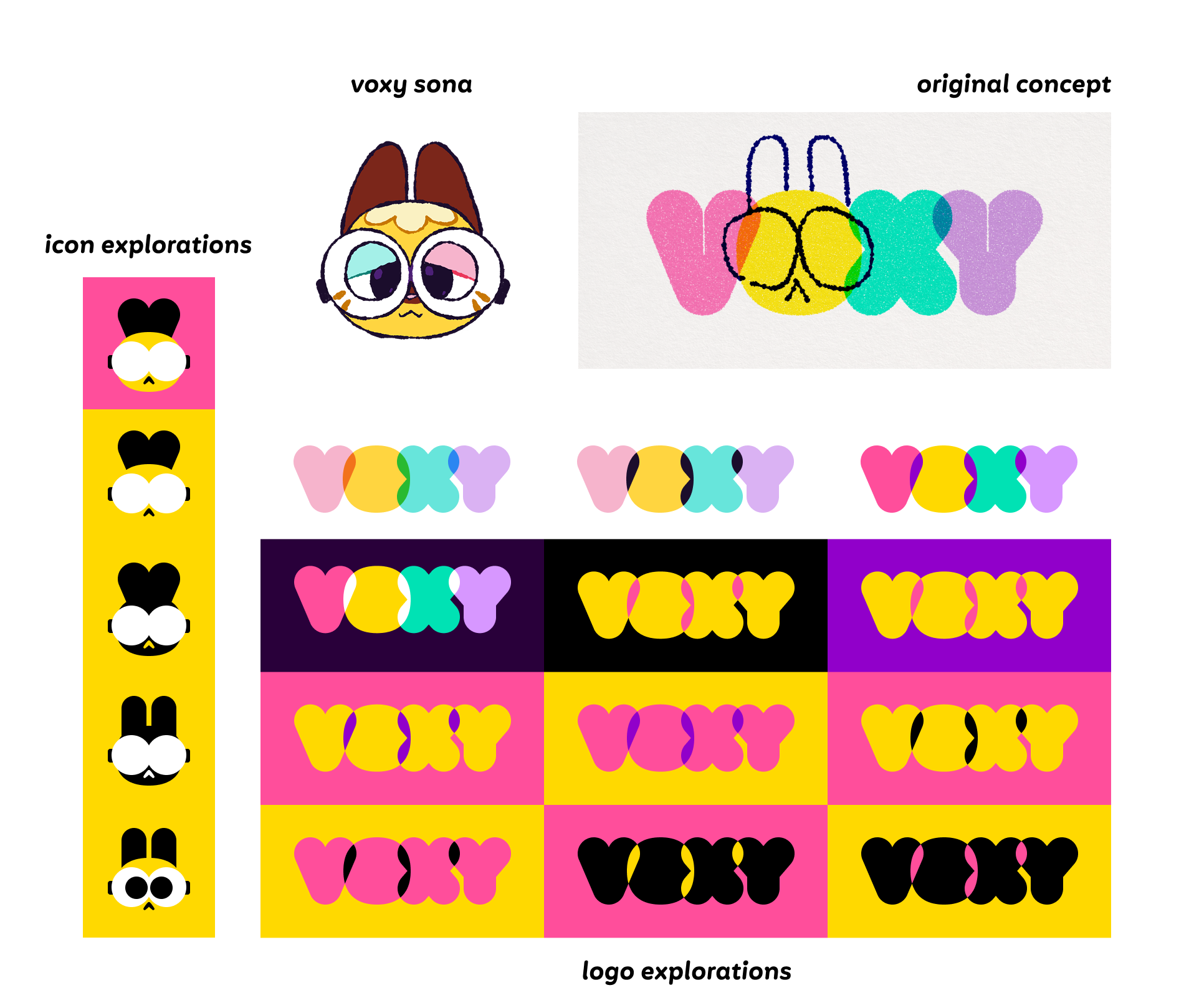
Let’s talk about the new design first, which was likely the first thing you’ve noticed. This new look builds upon my “rebrand” from late 2025. It was a time where I found myself struggling with what I wanted to represent myself with, cycling through iterations on my logo and visual language every few months, but never finding myself satisfied with it. Ultimately, I decided to start from scratch, and now that I’ve been rolling with it for several months, I think that was the move.
The soft purple and pastel colors gave way to a smaller, bolder palette of pure black and white, with a saturated yellow accompanied by magenta and cyan. This choice of colors is a nod to my background as a graphic designer (CMYK being the model of color printing), as well as my own identity as a pansexual person. On the topic of colors, my website is now (finally) available in both light and dark modes, unlike the previous version that was technically always in dark mode. It’s set up to automatically switch the theme based on your browser or operating system settings, but I might look into adding a manual toggle eventually!
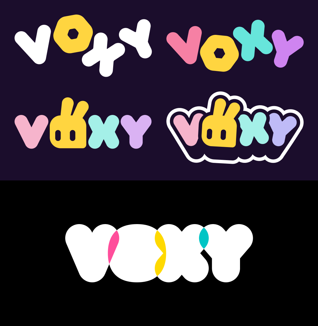
As for my logo, I went with a bolder, bubblier look, white-on-black (or the other way around depending on context) to make it extra striking, making the letters overlap to inject some color back in. I also put my rabbit sona front and center, shoving him into the simplify-o-tron 3000 to turn him into a suitable lil’ mascot I could use as an avatar or an icon alongside the main logo.
I also decided to use the humble squircle as a connective tissue of sorts, with one being the holding shape of the icon and the shape of the O in the logo, as well as all rounded corners on this website being squircular thanks to some recent CSS goodness. (Which will display as regular rounded corners if your browser isn’t compatible with that yet!)
All my projects, front and center
The previous “Games” section has evolved a fair bit. It’s now the “Projects” section, a place where I can showcase all kinds of notable things I’ve worked on. Of course, games will still belong there, but so will other projects of mine, like freelance work, assets, and more.
I also realized it was a great opportunity to just… talk about them, share some insights about the process of working on these, and showing off previously unreleased concepts and material along the way, too! 👀
You’ll find a curated selection of projects on the homepage, but I strongly encourage you to learn about the full roster by checking out the dedicated projects page. You’ll also find my Game Builder Garage tools there!
Sprinkling a dash of whimsy
While browsing this website, you might notice things are a little livelier, with buttons bouncing under your cursor or finger, and icons having a bunch of fun animations to them. This was heavily inspired by the awesome work of web developer and educator Josh W. Comeau, whose website is filled to the brim with this kind of absolutely delightful animations, and plenty of resources to teach you how to integrate them on your own website.
Techniques like these are so incredibly neat, and I can’t resist yapping about them in case some of you are interested in the technical deets. Strap in!
Warning: Here be jargons!
The following subchapters will contain a few more technical concepts and code snippets. It’s best to read them with some basic familiarity with HTML and CSS!
Making things spring to life
When animating elements with CSS, either via transitions or keyframed animations, we have the option to define a timing function, which tells the element how its speed changes over time.
element {
    transition-property: transform;
    transition-duration: 100ms;
    transition-timing-function: (insert valid timing function here);
    /* elements with an animation would use "animation-timing-function" */
}
This is important, because otherwise, our element would move at a constant speed throughout, called a linear timing function, which ends up looking very artificial:
That’s because objects don’t move like that in the real world, instead they tend to accelerate towards their cruising speed, and slow down (or decelerate) before coming to a rest. Luckily, we can do that pretty easily by representing the speed over time with a Bézier curve, something you might be familiar with if you’ve ever used the Pen tool in an image editing or vector drawing software. By curving it in different ways, we can represent all kinds of smooth accelerations, decelerations, or combinations of both!
linear
ease-in
ease-out
ease
Bézier curves have been standard CSS stuff for over a decade at this point. But in recent years, designers started falling in love with spring physics, and for good reason! They just feel… good. And they can replicate nuanced motion that a regular Bézier curve can’t. See for yourself:
ease
spring
As I’m writing this, CSS doesn’t have a native way to calculate spring physics, but luckily, we can use the next best thing, the linear() timing function.
“But Voxy, didn’t you just say linear transitions were unnatural and stuff?” You’re right, but this is not what I’m talking about here. The linear() function (note the parentheses) is different from a linear transition. It’s confusing, I know. What’s important is that this newfangled linear() function allows us to represent virtually any curve or shape, by representing it as a bunch of small line segments connected together (hence why it’s called linear()).
linear(0, 0.1 0.25, 0.75 0.5, 1) function
So how does that help us represent spring physics? Well, if you’re clever and use… eugh… math… you can actually depict the motion of a curve as a kind of sine wave, that dampens (weakens) over time until it comes to a rest, like so:
Then, you can simplify it into a bunch of straight lines, feed those numbers into the linear() function, and voilà! Beautiful spring animations, provided you give it enough lines to accurately represent the curve.
linear(
    0,
    0.003 0.4%,
    0.011 0.8%,
    0.025 1.2%,
    0.043 1.6%,
    0.093 2.4%,
    0.166 3.3%,
    0.244 4.1%,
    0.33 4.9%,
    0.692 8%,
    0.836 9.3%,
    0.966 10.6%,
    1.067 11.8%,
    1.117 12.5%,
    1.155 13.1%,
    1.188 13.7%,
    1.215 14.3%,
    1.238 14.9%,
    1.256 15.5%,
    1.269 16.1%,
    1.278 16.8%,
    1.282 17.6%,
    1.28 18.4%,
    1.271 19.2%,
    1.256 20.1%,
    1.235 21%,
    1.207 22%,
    1.057 26.6%,
    1.022 27.8%,
    0.992 29%,
    0.964 30.3%,
    0.944 31.6%,
    0.93 32.9%,
    0.922 34.3%,
    0.921 35.9%,
    0.927 37.7%,
    0.941 39.6%,
    0.983 44.2%,
    1.001 46.5%,
    1.015 49.1%,
    1.022 51.7%,
    1.022 53.5%,
    1.02 55.4%,
    1 64%,
    0.994 68.9%,
    0.994 73%,
    1.002 85.9%,
    1
)
linear() function generated from the simplified curve.
To generate the linear() function for my transitions and animations, I used this handy website called Easing Wizard, that allows you to tweak the parameters of the springs and lets you preview the results in real time. Neato!
Animated icons galore
On my website, you’ll find a bunch of icons decorating buttons and sections. They already look pretty good on their own, but as an added bonus, they each have a unique animation that plays when you move your mouse cursor over them!
My icons are drawn using the SVG format, a standard format for vector images on the web, which represents shapes and paths in a text format similar to HTML. If we open the SVG file for the download icon in a text editor, this is what it looks like:
<svg
    width="24"
    height="24"
    viewBox="0 0 24 24"
    fill="none"
    xmlns="http://www.w3.org/2000/svg"
>
    <path
        d="M8.5 6.5H6.5C5.39543 6.5 4.5 7.39543 4.5 8.5V17.5C4.5 18.6046 5.39543 19.5 6.5 19.5H15.5C16.6046 19.5 17.5 18.6046 17.5 17.5V15.5"
        stroke="currentColor"
        stroke-width="3"
        stroke-linecap="round"
    />
    <path
        d="M19.5 4.5L11.5 12.5"
        stroke="currentColor"
        stroke-width="3"
        stroke-linecap="round"
        stroke-linejoin="round"
    />
    <path
        d="M13.5 4.5H19.5V10.5"
        stroke="currentColor"
        stroke-width="3"
        stroke-linecap="round"
        stroke-linejoin="round"
    />
</svg>
We’ve got a main <svg> element, which contains a few <path> children elements, representing the actual shapes making up the icon. The letters and numbers inside the d attribute may look like weird gibberish, but they’re actually step-by-step instructions on how to draw the shape.
It’s like asking a magical SVG gnome to move to different coordinates on the canvas, and draw lines and curves from where they stand to another set of coordinates. For a more detailed explanation, check out this interactive guide.
Now, we could simply have our SVG icon be its own image file, and integrate it like we would any other image, like so:
<img
    src="assets/img/my-very-cool-image.svg"
>
It would display just fine, but that hides the individual paths from us. If we wanted to animate it, we’d only be able to animate the whole thing, and not the actual that make it up, thus limiting our possibilities. So instead, we can just… put all that SVG code right into our page markup! The elements contained inside are also valid HTML elements, so it just works! And as an added bonus, it also means we can give said elements class names…
<svg class="my-svg-icon">
    <path
        d="..."
        class="my-svg-icon-part"
    />
    <path
        d="..."
        class="my-other-svg-icon-part"
    />
</svg>
…that we can then target in our CSS to apply animations or transitions to individual shapes within our SVG element!
.my-svg-icon:hover > .my-svg-icon-part {
    animation-name: my-cool-animation;
}

.my-svg-icon:hover > .my-other-svg-icon-part {
    animation-name: my-other-cool-animation;
}
I’ll admit, it’s not a particularly intuitive way to create animations. Since you have to write all the animation data by hand, you basically have to guess numbers you think will look good, give it a try, and tweak it all until it actually looks good. It’s quite tedious, but ultimately, I think it’s worth it, because it’s just so much fun to move your cursor over these icons again and again to watch them bounce and swing and whatnot, and I can only encourage you to give it a try on your own websites!
No longer monologuing
Starting with this one, future articles on my blog now feature a comments section, powered by Bluesky! Each article will have an associated post on Bluesky, and replies to that post will be displayed below as comments. It’s a neat way to add some extra interactivity to this website without too much bloat or maintenance.
I yoinked the code from Caps Collective, who put up a great blogpost explaining how it works, and providing an example you can use on your own sites. Adding this feature reminded me of Tom Scott’s video about APIs in the days of Web 2.0, an optimistic era of the web where massive amounts of data could be accessible and transformed in new ways. The moment I peeked into the code and saw how simple it was to request a full JSON file containing every bit of useful data you could gather from a Bluesky thread, and how easily it could be displayed on a page like this, I felt that same high that web engineers from the Web 2.0 era likely felt upon realizing the possibilities of websites being able to “talk” to each other, exchange data and knowledge with such ease.
In an era where sharing your knowledge and/or craft means putting yourself at risk of having AI scrapers stealing your work and leaving it inaccessible to actual people to boot, it genuinely feels refreshing knowing that this sort of consensual data exchanging between sites is still possible and encouraged.
Closing thoughts
It’s been quite the journey reaching this point, and I’m very glad I took it. My website looks even more awesome now, I learned a lot of cool new tricks that’ll make future websites I work on even better, and perhaps most importantly, I think I finally realize how important this is, to have my own place where I can freely share my work and thoughts, talk about what I really want to talk, without forcing you to trudge through swathes of inauthentic AI-generated slop along the way.
I hope that’ll inspire me to continue writing for my blog. It might be just as sporadic as it is now, but honestly? I think that’s okay. And I hope you’ll be around when I write my next post. Until then, I hope you enjoy your time on my little space on the Internet, and thank you very much for reading this! 🫶
Oh, and one last thing! If you encounter issues with the new version of the website, please consider letting me know on GitHub! Your feedback is very much appreciated!
Have a lovely day!